#flex.html
<div class="container">
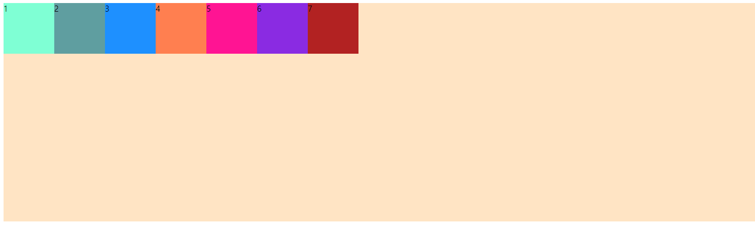
<div class="item item1">1</div>
<div class="item item2">2</div>
<div class="item item3">3</div>
<div class="item item4">4</div>
<div class="item item5">5</div>
<div class="item item6">6</div>
<div class="item item7">7</div>
</div> <style>
.container {
background-color: bisque;
height: 50vh;
}
.item {
width: 100px;
height: 100px;
}
.item1 {
background-color: aquamarine;
}
.item2 {
background-color: cadetblue;
}
.item3 {
background-color: dodgerblue;
}
.item4 {
background-color: coral;
}
.item5 {
background-color: deeppink;
}
.item6 {
background-color: blueviolet;
}
.item7 {
background-color: firebrick;
}
</style>
container와 item들이 부모와 자식 관계일 대 container에 display:flex속성을 줌으로써 레이아웃을 변경할 수 있다.
        .container {
            display: flex;
        }
container 속성
1) flex-direction : container안에서 item들의 정렬과 배치 방향을 설정하는 속성
display:flex를 정의했을 때 디폴트는 row속성이다.
row / row-reverse / column / column-reverse
        .container {
            flex-direction: row | row-reverse | column | column-reverse;
        }


2) flex-wrap : item들의 너비의 합이 container의 너비(현재 브라우저 창의 너비)를 초과할 때 어떻게 처리할지 결정하는 속성
nowrap / wrap
        .container {
            flex-wrap: nowrap | wrap;
        }


3) justify-content : flex-dirction을 기준으로 정렬을 담당한다. (item과 container간에 수평방향으로 여백을 두는 방식을 지정)
flex-start | flex-end | center | space-between | space-around
        .container {
            justify-content: flex-start | flex-end | center | space-between | space-around;
        }

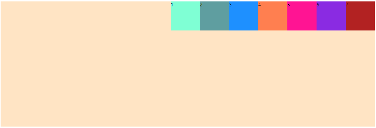


아래 속성을 확인하기 위해 itme1에 padding 20px추가
        .item1 {
            background-color: aquamarine;
            padding: 20px;
        }
4) align-items : justify-content 속성이 수평 방향으로 여백을 주는 속성이라면 align-items는 수직 방향으로 여백을 주는 방식을 설정
baseline을 기준으로 정렬되는 것은 flex-start 방식과 비교하면 좀 더 쉽게 이해할 수 있다.
baseline / center / flex-start / flex-end
        .container {
            align-items: baseline | center | flex-start | flex-end;
        }


5) align-container : item들을 한 줄에 다 표시할 수 없어서 다음줄로 넘김이 발생했을 때 줄 사이의 여백을 주는 방식 설정
flex-wrap : wrap;속성이 함께 설정되어 있어야 제대로 동작한다.
center / flex-start / flex-end / space-around / space-between
        .container {
            flex-wrap: wrap;
            align-content: center | flex-start | flex-end | space-around | space-between ;
        }


item 속성
div 3개만 남기고 주석처리 하기
    <div class="container">
        <div class="item item1">1</div>
        <div class="item item2">2</div>
        <div class="item item3">3</div>
        <!--
        <div class="item item4">4</div>
        <div class="item item5">5</div>
        <div class="item item6">6</div>
        <div class="item item7">7</div>
        -->
    </div>
1) flex-grow : container에 여분의 여백이 있을 때 동작하는 속성
여분의 여백이 있다면 flex-grow에 설정된 비율만큼 분배되도록 동작한다.
        .item1 {
            background-color: aquamarine;
            flex-grow: 1;
        }
2) flex-shrink : item이 줄어드는 비율을 설정
여분의 여백이 있다면 flex-grow에 설정된 비율만큼 분배되도록 동작한다.
        .item1 {
            background-color: aquamarine;
            flex-shrink: 1;
        }
3) align-self: align-item을 자식요소 하나에만 적용하는 것
auto / flex-start / flex-end / center
        .item1 {
            background-color: aquamarine;
            align-self: flex-start;
        }

        .item2 {
            background-color: cadetblue;
            align-self: center;
        }

        .item3 {
            background-color: dodgerblue;
            align-self: flex-end;
        }
'JQuery' 카테고리의 다른 글
| 07_반응형 웹(5) : bootstrap (0) | 2020.11.03 |
|---|---|
| 07_반응형 웹(4) : modal (0) | 2020.11.03 |
| 07_반응형 웹(실습예제(1)) (0) | 2020.11.02 |
| 07_반응형 웹(2) : 미디어쿼리 (0) | 2020.11.02 |
| 07_반응형 웹(1) : 레이아웃 (0) | 2020.11.02 |